
THE CHALLENGE
THE GOAL
MY ROLE
UX Researcher
+
UX Designer
5 Months after the Jamba Mobile App redesign and launch, with thousands of customer reviews, app review scores were so low it was bananas 🍌
Improve the customer journey and decrease cart abandonment through User Centered Research & Design

Scope
Team of 4 students
Focus Brands Industry Partner
August 2019 - December 2019


Outline:
4 Major
Research &Design
PHASES ➡️
P1 🍑
PHASE 1.Exploring the Problem space
Phase 1 FINDINGS
🍑GOAL:
Answer Preliminary Research Questions
Who are our users? What are their Intentions + Frustrations?
What can we learn from successful order-ahead applications?
What can we learn about the customer journey and drop-off points from our app reviews and analytics?
🍑PHASE 1 PROCESS:
-
Research: Completing Lit Review, Competitive Analysis, Task Analysis, Usability Studies, and Surveys-- Gaining robust background understanding
-
Compiling Ranking and Analyzing all major findings into a database: converging on certain ideas as center points of redesign
-
Synthesizing Design Implications: Creating Design implications based on major findings
-
Creating wireframes based on Design Implications
🍑METHODS I TOOK THE LEAD ON: Lit Review and coding of current App Reviews, Online Survey Design and Dispersal, Field Studies and Contextual Interviews
🍑Link to Full Phase 1 Brief: details on Survey Design, Contextual Inquiry, Design Implications

50% of consumers are using order-ahead applications more than 2X a month (n=32)

Compilation of Phase 1 User Interview Findings
CHALLENGES
The application was just redesigned and users loved the graphic design but still only 4.3% of users in the sales funnel were completing orders.
We faced challenges in this phase with learning about what users like and dislike about restaurant applications, specifically order-ahead applications, we spent a ton of time going through app reviews and coding them to find the main pain points.
We also faced the challenge of interviewing someone who is mid-order, because our interviewees were there at our interviews specifically to complete an order. This phase was a major learning phase on the user needs and tasks, the order-ahead app problem space, and specific Jamba Issues.

15 Major Findings Total; Displaying Top 5
REDESIGNS: Wireframes

OLD JAMBA APP ➡️ New Wireframes

⬅️ MENU PAGE:
More detail on ingredients
Allows user to compare easily
Displaying search function
➡️ ORDER STATUS PAGE:
Increased visibility of System Status
Familiarity + Minimalism

P2 🍋
PHASE 2. Testing Wireframes in person + Designing Mock-ups
🍋GOAL: Test the usability of our newly designed wireframes in order to gain more insight into our changes to labeling and design. Assess and gain ideas for potential redesigns for our future mock-ups and prototypes.
🍋PHASE 2 PROCESS:
-
Conduct Task-Based Usability Studies on our mock-ups created in phase 1
-
Complete a post-walk-through interview in order to measure certain usability criteria
-
Compiling all user thoughts and notes into actionable items on our Figma board
-
Creating our mock-ups
🍋METHODS I TOOK THE LEAD ON: Creation of Evaluation Criteria, Usability Study Design, Usability Measures and Metrics, Design Implications Synthesis
🍋Link to Full Phase 2 Brief: details on Usability Study Design, Evaluation Methods and Criteria and Design Implications
CHALLENGES
The main challenge here was going from the broad scope of looking at the app as a whole and breaking it down into manageable and changeable parts.
In order to combat this challenge, we ended up splitting our research and redesign into 3 sections, Sign-up, Ordering, and Check-out. We also split up tasks into design oriented and label oriented tasks.
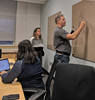
User Testing

User Testing Was completed with 5 subjects, we went through certain tasks with a think-aloud method and then interviewed the users afterwards. Interviews were recorded to capture interactions.
InterView questions

For all Interview Questions Click Here
DESIGN IMPLICATIONS

💡Status Check
With all of the design implications (above) gained in this phase, we decided to focus on these aspects when redesigning our wireframes for our next rounds of testing.
We did not use the S.U.S. (System Usability Score) at this point because it was not optimal to use this usability scale on a semi-functioning mock-up of an application.
Next we will look at changes made when transitioning to wireframes, the usability testing for our wireframes, and the design implications gained from that testing.
Notes from cognitive task-based walk-throughs

Compilation of Phase 2 Research Findings
OLD JAMBA APP ➡️ Wireframes ➡️ Mock-ups

In the example below, you can see that we incorporated Consistency, Clarity, and Improvement of Data Display in order to meet customer needs identified during our User Research phases and post-research brainstorming sessions.
P3 🍉
PHASE 3. Testing Mock-ups in person + Designing Final Prototype
🍉GOAL: In assessing the redesigned mock-ups, we focused our user research entirely on New Users, as we wanted to focus on our main user group identified in phase 1. In this phase we are seeking exploratory design implications and ideas. We specifically looked at scroll patterns and data display patterns.
🍉PHASE 3 PROCESS:
-
Conduct Task-Based Usability Studies on our mock-ups created in phase 2
-
Complete a post-walk-through SUS survey in order to gain comparative data on our design and the original Jamba Application
-
Compiling all user thoughts and notes into actionable items on our Figma board
-
Creating our working prototype
🍉METHODS I TOOK THE LEAD ON: Design of sign-up and check-out screens in Figma, Creation of Evaluation Criteria, Usability Study Design, Design Implications Synthesis
🍉Link to Full Phase 3 Brief: details on Usability Study Design, Evaluation Methods and Criteria and Redesign
Top 5 design implications based on research findings

CHALLENGES
The main challenge in this phase was testing certain portions of the app that were theoretical in nature. These concepts included Cognitive Load and Voice of the App.
We begun to hone in on Information Architecture which included object labeling, flow, and a User Pre-emptive Design Structure. It was important to us to create a parsimonious design without limiting the user's ability to compare and make quick decisions within the application.
User Testing
User Testing Was completed with 7 completely new subjects, we went through a task-based Usability Study and had our users fill out a System Usability Scale in order to compare our mock-up usability to the original Jamba application.
The System Usability Scores below reflected to us that we were on the correct path to ensuring usability for the Jamba app but that there was still room to improve our design

all User interview notes

OLD JAMBA APP ➡️ Wireframes ➡️ Mock-ups ➡️ Prototype
In the example below, you can see how we incorporated System Visibility in order to decrease User Cognitive load and Increase Predictability within this portion of the application. In this phase we worked to increase predictability in Sign-up, Order, and Check-out.

Example user note:

💡Status Check
With the increase in User Research and SUS scores gained in this phase we worked out major design implications to be addressed in our final phase of re-design for our Prototype.
In the next phase we go from Exploratory Research to Confirmatory Research in order to test the effectiveness of our prototype.
P4 🍒
PHASE 4. Testing Prototype for effectiveness in initial goal
🍉GOAL: We switch to a confirmatory design phase here. We are looking to confirm all of our changes to the application before our final presentation to the Digital Team at Jamba
🍉PHASE 4 PROCESS:
-
Expert Evaluations with 3 Field Experts using Heuristic Evaluations
-
In-store Usability Studies with 5 Jamba Customers + SUS and Timing of tasks
-
9 Subjects - Online Remote Testing + SUS and task based think-aloud commentary
-
Compiling all user thoughts and notes into actionable items on our Figma board
-
Creating future of the design ideas and confirming the work done over the course of the project
🍉METHODS I TOOK THE LEAD ON: Remote Usability Testing, Expert Evaluations, SUS Analysis, Design Implications for the Future
🍉Link to Full Phase 4 Brief: details on Remote Usability Study Design, Expert Evaluation Methods, Constraints, and Design Ideas for the Future
2. Usability Testing at Jamba with users + Findings
Conducting Task-based Walk-throughs that were timed, in-store in order to combat biases in our feedback we were gaining
-A/B Testing Original Jamba VS Our Prototype
-Timed Each Task
-SUS scores completed afterwards

3. remote Usability Testing on user-testing.com
Conducting Task-based Walk-throughs that were timed, and recorded online
-9 participants accross the United States
-Timed Each Task
-SUS scores completed afterwards
CHALLENGES
This phase faced unique challenges. We ran into technical errors with our Remote Online Interviews. The way we structured tasks and questions had to be altered to be more clear since we were unable to use a moderator in this phase.
In the expert interviews, we came back with some major findings in regards to the voice of the overall application that we ended up working on before completing our in-person testing.
A final challenge was creating actionable future ideas for the Jamba team to work on that we just did not have the bandwidth to handle. For example, one of our main findings was the need for dynamic nutritional information which we did not have the ability to test but advised the Jamba team to look into it for future User Experience Modifcations.
1. Expert evaluations + Findings
Conducted Walk-throughs with 3 Experts
-Walk-through 1 was a think aloud to get them familiar with the app
-Walk-through 2 was designed for them to rate us on Heuristic Criteria below
-After this phase, we altered a few things and moved forward with User Testing in store and Online Remotely.


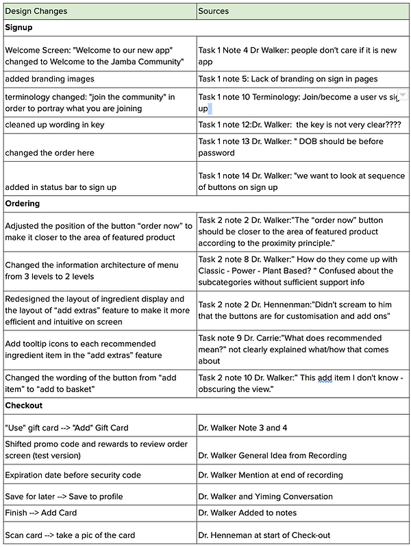

Design CHANGES
Quantifying our Improvement of usability
The SUS Score we ended up with from Testing our final prototype In-store and Online is reflected to the right. We tested users we did not know in order to decrease bias. We were happy to present this news to the folks at Jamba, as a way to solidify our design concepts.

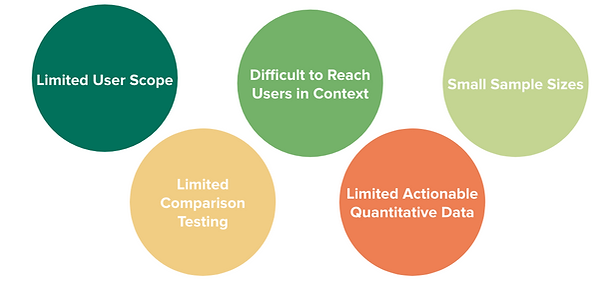
Research constraints
future design research ideas

Final Note
Research and Design on this project would not have been possible without our Partners at Focus Brands, our Professors at Georgia Tech, and my amazing team members. Thank you to Team Fly Like a Beagle for making this project re-design so enjoyable and enriching!