
MY ROLE
End-to-end Product Designer
SCOPE
6 Months Course Collaboration
Team of 2 Designers + Google Product/Design/Eng team
Weekly Design Reviews
30 User Interviews
7 Rounds of Design iterations
BACKGROUND
Codesign is Web Component-based Prototyping Tool. Similar to Figma but components can be design or code <🧩>
Pretty cool right?
The app has 3 different marketplaces but users are barely using them. With user numbers increasing and 2 new asset types coming to Codesign Marketplaces, it's time to improve the usability!
GOAL
Improve Marketplace user experience focusing on clarity, discoverability, and predictability.


PROCESS
Research Competitive Analysis, Current State Audit, User Interviews
Ideation User Research, 3-Day Design Sprint
Design Wireframes, Mockups, Prototypes
Evaluation Task-based User Testing


RESEARCH
This phase was focused on getting to know the app and problem space.
Through competitive analysis and the current state analysis, we started to pick up on 3 core focus areas.
With these focus areas in mind, we interviewed 8 Google Users (UXE,IxD,UXR) and 6 Designers outside of Google. The goal here was to go in depth about how users navigated marketplaces in their current design tools and identify pain points and gain points.

Competitive Analysis Focus areas
Finding assets
Publishing Assets
Updating Assets
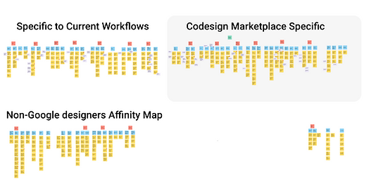
Affinity Mapping Categories
Users are looking for
Clarity, Discoverability, Predictability

Overall Findings
⬅️ 👀
With these findings we were able to create personas and move into the next phase.

IDEATION
Now that we knew who our users were and what they needed, we could get to ideating!
We quickly planned and executed a 3 day long Google Design Sprint with the team, users, and stakeholders.
The goal of the sprint was to walk away with wireframes that would lead creation of a better experience for marketplace for publishing, version control, as well as search.
Sprint Outcome
We were able to diverge to ideate then come back together and walk out of the sprint on the same page with a path forward / wireframes for the 4 newly defined flows: Starting a project, Marketplace search, Component Publishing, and Component Updates.
⬅️ 👀 Example
DESIGN
After identifying the flows where we could have the most user impact we moved forward to wireframes, mockups, and prototyping.
During this phase we had weekly design reviews with the Google Codesign team including Eng, Prod, Design.
It was a whirlwind of rapid prototyping. We were moving so quickly that one of our Google team members told us "I can't believe how much you guys are getting done" 💪

Wireframes
Goal Working on higher level concepts
Focus Flow 2: Codesign Marketplace Search
⬅️ Example
Overlay of marketplace search
Attribute based filtering
Verified/Accessibility chips
Mockups
Goal Consistency, Integration, Details
Focus Flow 1,2,3,4 (Starting a project, Marketplace search, Component Publishing, and Component Updates)
Example ➡️
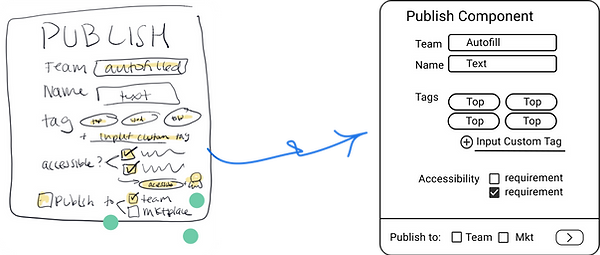
Publish Flow
Interactive Component
Accessibility
Side Panel Drawer


Prototypes
Goal Testing Predictability, Consistency,
Ease of Use
Focus Flow 1,2,3,4 (Starting a project, Marketplace search, Component Publishing, and Component Updates)
⬅️ Example
Marketplace Search Flow
Most Used
Trending
Recently used
Recommended

EVALUATION
After identifying the user needs of clarity, discoverability, and predictability in our initial testing, then building out the 4 flows to account for those needs, it is now time to test out the prototypes.
We ran two rounds of testing with 19 users in total.
For the 4 flows, we laid out the metrics we will use to measure success. ⬇️

Findings:
Project Templates: 4.6/5
Codesign Marketplace: 4.4/5 & 4.9/5
Component Publishing: 5/5
Component Updates: 5/5 & 4.5/5
Sidenote:
We decided to focus efforts on flows 1 & 2 for the second round of testing.
Flows 3&4 only underwent one testing round due to the high usability scores and our need to prioritize user time.
Example:
We we made usability tweaks to all 4 flows. I am going to show one of the designs that I took the lead on, but for more go here.
Example ⬇️
Codesign Marketplace
Change to allow for multi-select of components from marketplace view and detail view

"I want the option to select multiple components at a time..."
- Codesign user
CONCLUSION
Overall
We were able to take an open ended brief, identify user needs and pain points, identify the flows and feature work needed to address those pains and execute from there.
Of course our final metrics show that we were able to reach our goals, but it was also great to have our stakeholders invested and congratulatory on our work done for Codesign.
Next Steps
1. Expand to other types of assets
2. Analytics dashboard with component usage details for design contributors
3. Adding component groups and favorites
Learnings
1. It's always best to come to design review with 3 options or less
2. Watching the users actions > Listening to their responses
3. How to pivot during a design sprint and encourage confidence
Thank you
Thank you to the Codesign Users for their time, the Codesign team for the mentorship, and my teammate Guru for teaching me new figma-isms. 👩💻 And... Thank you for taking the time to check out my work!